Excel chart labels disappearing is a common but frustrating issue that affects many customers worldwide. Here, the axis labels or data labels that should be visible are either missing, skipped, or appear blank on the chart. Fret not if you are one such user, as this can be fixed easily. In this article, we will outline step-by-step solutions to restore missing labels.
Why is my Excel chart not showing data labels?
Excel chart may not be showing data labels due to incorrect data source ranges, a common software glitch, or manual formatting overrides. It can also be due to automatic settings where Excel hides labels to prevent overlap. To know about the issue in detail, continue with the next section.
Fix Excel chart labels disappear
If the chart labels disappear in Excel, try the solutions below.
- Reset chat layout and toggle label links
- Check the fundamental data source
- Correct Axis scale and bounds
- Manually create space for labels
- Simplify and rebuild complex charts
- Check display settings and final checks
Let’s get started with the troubleshooting guide.
1] Reset chat layout and toggle label links
![Excel chart labels disappear [Fix]](https://www.thewindowsclub.com/wp-content/uploads/2026/02/excel-data-label.jpg "Excel chart labels disappear [Fix]")
A common software glitch can be contributing to the issue at hand. To address this, we are going to reset the layout and relink labels to force Excel to completely refresh the chart’s internal rendering engine.
- Select the chart, and go to the Chart Design tab.
- Click on Quick Layout, and select any layout different from the current one.
- Next, right-click on a data label in the series and choose Format Data Labels. In the pane that opens, uncheck the Value From Cells, then click OK.
- Immediately reopen the Format Data Labels, re-check Value From Cells, and when prompted, reselect the correct range of cells containing the labels.
Now, check if the labels are visible. See the next solution if the issue remains the same.
2] Check the fundamental data source
The labels can be hidden when the chart’s data source range is incorrect, incomplete, or configured to exclude information from hidden cells. To fix the problem at its root, we are going to verify and correct the source range.
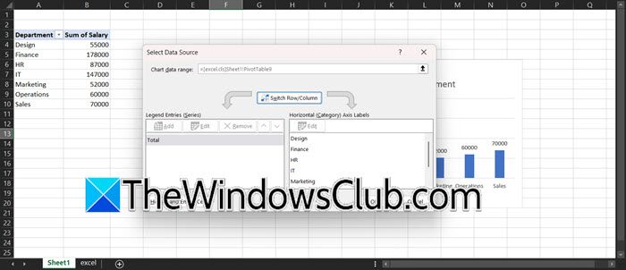
- Right-click anywhere on the chart area and click on Select Data.
- In the dialogue box, carefully inspect the Chart data range field at the top, and ensure that it includes all rows and columns of the data.
- In the bottom pane, click on Edit, and verify that the range shown includes every cell meant for the axis labels.
- Next, click on the Hidden and Empty cells button while still in the Select Data Source dialogue, enable the Show data in hidden rows and columns checkbox, and click OK.
If the labels are still missing after confirming the data range, the problem may not be the data itself, so go to the next solution.
3] Correct Axis scale and bounds
If minimum or maximum bounds are manually set, any text lying outside this arbitrary window automatically becomes invisible. To give Excel control over axis scaling to fit all data, we will set the axis bounds to Auto.

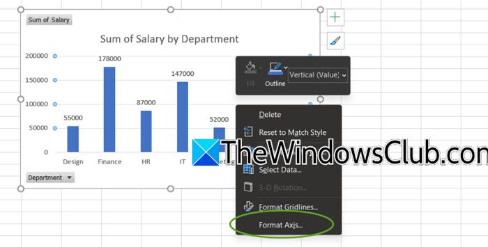
- Right-click directly on the vertical axis of the chart, select Format Axis, and navigate to the Axis Options tab.
- In the Bounds section, verify if the Minimum and Maximum settings are set to Fixed. If it is set to Fixed, change it to Auto or click the reset button.
- In the Units section, ensure Major and Minor units are also set to Auto mode.
Now, verify the situation. If adjusting the axis scale doesn’t resolve the issue, go to the next solution.
4] Manually create space for labels
Excel automatically hides it lables that can overlap, which can lead to skipped or truncated text. To ensure all labels display clearly, we will enlarge the chart, reduce the font size, or change the orientation to override Excel’s default hiding behaviour.
Follow the steps below to do so.
- Click on the border of the chart area to select it, and click and drag one of the corner handles outward to significantly enlarge the entire chart object.
- To adjust text, right-click the crowded axis labels, select Format Axis, and go to the Text Options section.
- There, reduce the Font size, navigate to the Axis Options, and find Labels.
- Experiment with the Label Position dropdown, and set it to Low. For long text labels on a column chart, change the chart type by right-clicking the chart, selecting the Change Chart Type option, and choosing a Bar Chart.
See the next solution if the issue persists.
5] Simplify and rebuild complex charts
Combo charts, or those with secondary axes, can experience formatting corruption that basic charts avoid. In such conditions, temporarily converting a complex chart to a simple one and back can reset all underlying plotting instructions and resolve label display errors.
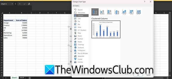
- Right-click the chart, select Change Chart Type, and in the dialogue box that appears, choose a basic type like Clustered Column.
- Click OK, and check if the labels are visible. If the labels are now visible, right-click the chart again and select Change Chart Type.
- Navigate back to the original chart type, reselect it, and click OK.
If simplifying the chart type fails, move to the next solution.
Read: How to create Gantt Chart using Excel
6] Check display settings and final checks
Excel’s graphic engine may miscalculate label positions at certain zoom levels or when high system display scaling is enabled. To provide a stable, predictable environment for Excel to render the chart correctly, go to Excel, adjust the zoom slider to 100%. Resize the chart window slightly or scroll in and out after zooming to trigger a screen refresh. Next, open Windows Settings, go to System, then Display, and check the Scale setting. If it is set above 125 per cent, temporarily change it to a lower value, then fully close and reopen Excel for the changes to take effect. As a final check, review the chart’s source data range and make sure none of the cells are merged. Merged cells can interfere with how Excel links data to chart labels.
That’s it!
Read: How to create a Bar Graph or Column Chart in Excel
How to make a chart title automatically update in Excel?
To automatically update a chart title in Excel, link it to a worksheet cell. For that, click the chart title, type an equal sign (=) in the formula bar and then click the cell that contains the desired text. Any changes made to that cell will automatically update the chart title.
Also Read: Insert a Dynamic Chart in Excel spreadsheet.