
Charts are helpful for showing information to an audience in graphics, making it easier to understand. There are a variety of charts available in Microsoft Excel, such as Pie, Column, Line, Histogram, and Bar Charts, which are frequently used by Excel users to analyze or demonstrate important relationships or patterns between data points. There are other charts available in Excel other than the most common ones mentioned, such as the Treemap chart.
A Treemap chart provides a hierarchical view of data and makes it easy to spot patterns. The treemap chart branches are represented by rectangles, and each sub-branch is shown as a small rectangle. The treemap chart displays data in categories and also by color and proximity and can easily show a lot of data compared to other charts. The Treemap chart is great for comparing proportions within the hierarchy, yet it is not great for showing hierarchical levels between the largest levels and each data point. The Sunburst chart is a much better visual chart for showing that.
How to create a Treemap chart in Excel
Follow the steps below to create a treemap chart in Excel:
- Select the data in your table.
- Go to insert.
- Click the Recommended Chart button.
- Click the All Charts tab.
- Click Treemap
- Then click OK.
- The treemap chart is inserted into the spreadsheet.
Highlight the data you want to include in your chart from the table.
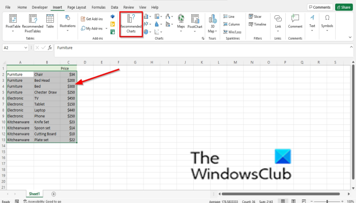
Click the Insert tab.
Click the Recommended Chart button in the Charts group.
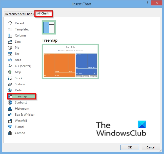
An Insert Chart dialog box will open.
Click the All Charts tab.
Click the Treemap chart on the left of the dialog box.
Then click Ok.
The treemap chart is inserted into the spreadsheet.
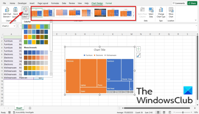
You can change the chart style by choosing a style from the Style gallery or change the color of the chart by clicking the Color button and choosing the pattern of color you want on the Chart Design tab.
READ: How to create a Gauge Chart in Excel
Why is it called a treemap?
The treemap chart is available in Excel, and you can use this chart to represent data in your table in categories. This chart is called a treemap because it represents hierarchical data in a tree-like structure.
What is a treemap chart used for?
Treemaps are used to capture relative sizes of data categories. They visualize a large amount of data in a hierarchical, tree-like structure. Treemaps are often used in sales data, especially for comparing product sales.
Why is a TreeMap better than a pie chart?
The pie chart is a very common chart to visualize part-of-a-whole relationships and show proportions, but when the data has a more hierarchical structure, treemaps perform the task more efficiently. Treemaps are good for comparing proportions in the hierarchy view.
What does a treemap look like?
A treemap is represented in a tree structure. The treemap is displayed in rectangles divided up into smaller rectangles to represent sub-categories. The size of the sub-category rectangles represents a quantitative value.
READ: How to create a Box and Whisker Chart in Excel
We hope this tutorial helps you understand how to create a treemap chart in Excel; if you have questions about the tutorial, let us know in the comments.
