In this guide, we show you how to create a Pareto chart in Excel. Excel is the best. Though we have many free and paid alternatives, the ease with which we can create complex data sheets and perform analysis is simply unmatched by any other tool or program. That must be why it has been the go-to program for spreadsheets, from personal to professional use. We can gather data, analyze it, and create charts to present it in a simple-to-understand form.

What is a Pareto Chart?
A Pareto chart is a type of bar chart that shows how different factors affect something. The factors are shown in individual bars, and a line graph shows their impact. The idea behind the Pareto chart is the Pareto principle, which states that a small number of causes affect the whole.
To put it simply, a Pareto chart is a bar graph with a line graph overlaid on the bars. Often in a Pareto chart, the largest bars show the factors that contribute more, and the smallest bars show the smallest contributions.
Pareto charts are used in organizations for quality control analysis, defect or product complaint analysis, customer support issues, and process, cost, or risk analysis.
How to create Pareto chart in Excel
Creating a Pareto chart in Excel is a simple process. Follow the steps exactly, and you will end up with a Pareto chart.
- Enter the data of factors/variables
- Sort the data from largest to smallest
- Add columns to calculate the cumulative count and percentage
- Insert a Pareto chart
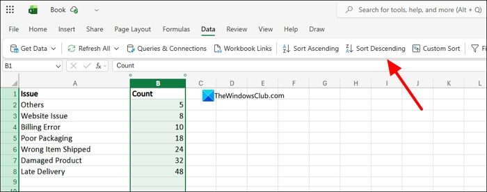
To create a Pareto chart in Excel, we need data on multiple factors or variables. Open Excel on a web browser or as an app on your PC, create a new Workbook, and enter the data. After entering all the data, we need to sort them from largest to smallest. We have created rough data and titled them Issue and Count. Count carries the number. To sort the data, select the Count column and click Data on the menu and select Sort Descending. It will sort the data from the largest to the smallest values.
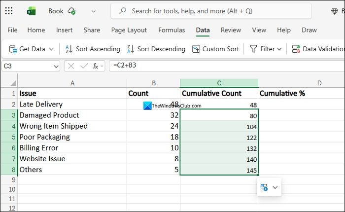
Now, create two columns beside the Count column. Name them Cumulative Count and Cumulative %. Under Cumulative Count, we need to create values. For C2, the value is the same as B2. For C3, it is C2+B3. Enter these values and then drag them to the end of the data to create the cumulative count values automatically.
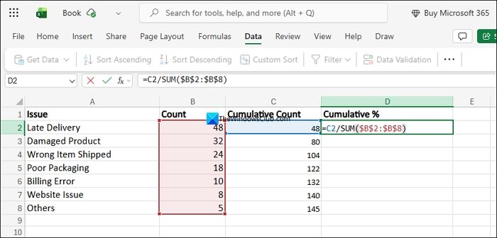
To calculate the cumulative percentage, we need to divide the Cumulative count by the total count. We can always add data to the same Workbook and calculate the cumulative percentage correctly. To do that, we need to sum the values using a formula that remains constant and yields real data. For that, we use the following formula.
SUM($B$2:$B$8)
The formula calculates the sum of the count. The $ in the formula makes sure the range stays fixed even when we drag it to new cells below.
In the D2 cell, where we need to calculate the Cumulative percentage, divide the cumulative count by the sum formula above.
=C2/SUM($B$2:$B$8)
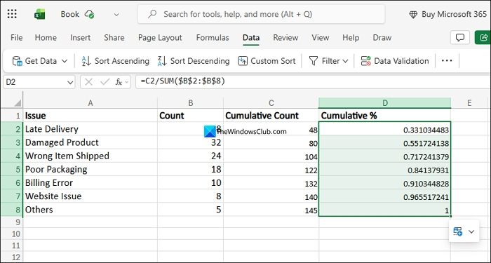
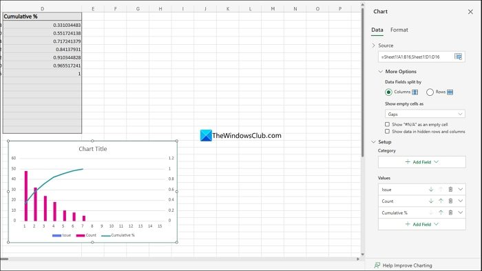
It will calculate the cumulative percentage for D2. Drag the cell to the end of the data to apply the same formula to the cells below.
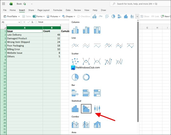
Now, select the Issue, Count, and Cumulative % tabs. Click on Insert on the menu and click the charts drop-down. Select the Pareto chart/Combo chart if you are using the Excel program on your PC. If you are using the web version, select Column Clustured – Line on Secondary Axis.
The Pareto chart will appear as you have intended. If you want to tweak anything, click on the Pareto chart to see its details, like Data and Format. Change the tabs, data, and everything, however suits you.
Read: How to insert a Dynamic Chart in an Excel spreadsheet
How to apply the 80/20 Rule in Excel?
The 80/20 rule is famous from the Pareto principle. To apply the 80/20 rule, you need to sort the data you have entered in the Workbook in descending order. It makes it easy for the Pareto chart to work as intended in the 80/20 rule. You need to sort only the values or counts of each factor. The rest of the data must be created only after sorting it in descending order.
Related read: How to create an Organization Chart in Excel.