
Adding Error bars in Microsoft Excel is simple, but ensure you’ve already added a graph to your spreadsheet because this article will not explain how to add graphs, but rather how to add Error bars. Some of the most common reasons people choose to use Error bars on their graph are standard deviation and trending margin of error. Whenever error bars are added in Excel, users can look at the standard deviation for each marker located on the chart. Still, error bars can be used for multiple purposes, so there is no need to limit oneself to popular reasons.
How to add Error bars in Excel
As we have stated above, you will need to begin with an existing graph, so ensure one is created and opened before going forward.
Select the Chart Elements button
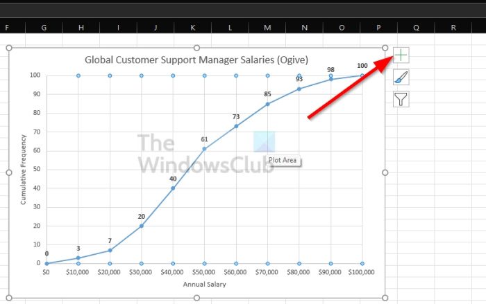
- In order to find the Chart Elements button, you must first click on the chart itself.
- From the right of the chart, you’ll see a + symbol.
- Go ahead and click on that symbol.
Enable Error bars
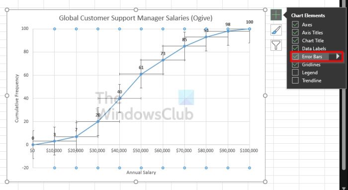
- To do this, tick the Error Bars box via the dropdown menu to enable it.
- However, if you also click on the arrow that points to the right, it will reveal additional pre-configured options for the error bar.
How to customize the Excel Error bar
Customizing the error bar is not difficult if you know what you want to accomplish. If you’re interested, let’s take a quick look at the options available.
Click on the Chart Elements button
- First, select the chart by clicking on it.
- From there, click the plus icon to reveal a dropdown menu.
Go to Format Error Bars
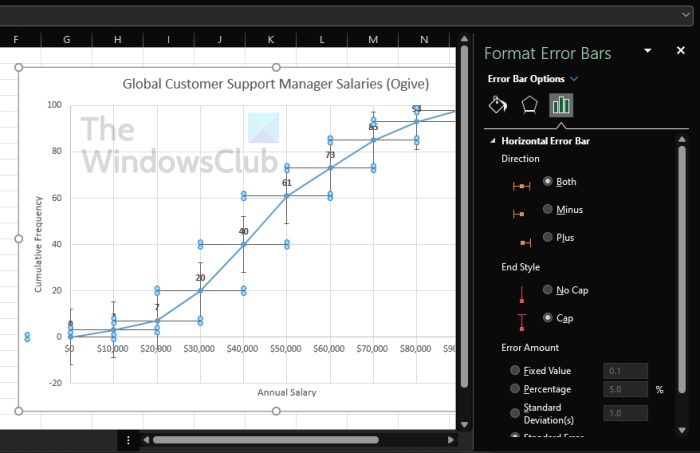
- From beside Error Bars, click the arrow pointing to the right.
- Finally, select More Options to reveal the Format Error Bars area.
Things you can do
From the newly revealed area, users can change the color and effects of the graph. Additionally, you can choose unique values to further customize the chart.
Read: How to copy values from the Status Bar in Excel
Do you really need to add error bars to Excel?
In some situations, adding an error bar to a graph is not required. It is usually done when the user wants to perform statistical calculations and needs to show the error size for the analyzed data.
At the end of the day, error bars can be used in anything as long as you can make it work, so go ahead and tinker around.
Now, we need to explain what these options are just so you have an understanding before selecting any from the list.
What are Pre-configured error bar options?
- Standard Error: This will highlight the standard error for each available data point.
- Percentage: If you want to calculate and show a specific error percentage for each data point, then choose this option.
- Standard Deviation: When this option is selected, Microsoft Excel will calculate and show the standard deviation for all values, but it only highlights a single one for each.
- More Options: This section, then, is all about giving the user the ability to customize rather than simply accepting the pre-configured alternatives.
What do error bars on Excel tell you?
Error bars on a chart are graphical representations of what is called Data Variability, and they tend to showcase to users the precision of a measurement. In a typical situation, the error bars represent the standard deviation and estimate it based on a provided sample.
What does a large error bar mean?
The length of the error bar helps reveal the uncertainty of any given data point. A short error bar proves that values are more concentrated, while a long error bar tends to indicate values are more reliable.
